Chart 01 · Departments
Avg. Resolution Time by Department
Mean days from open → close, sorted descending. Average is used here (not median) to surface worst-case strain — a single 400-day outlier is a real accountability signal.
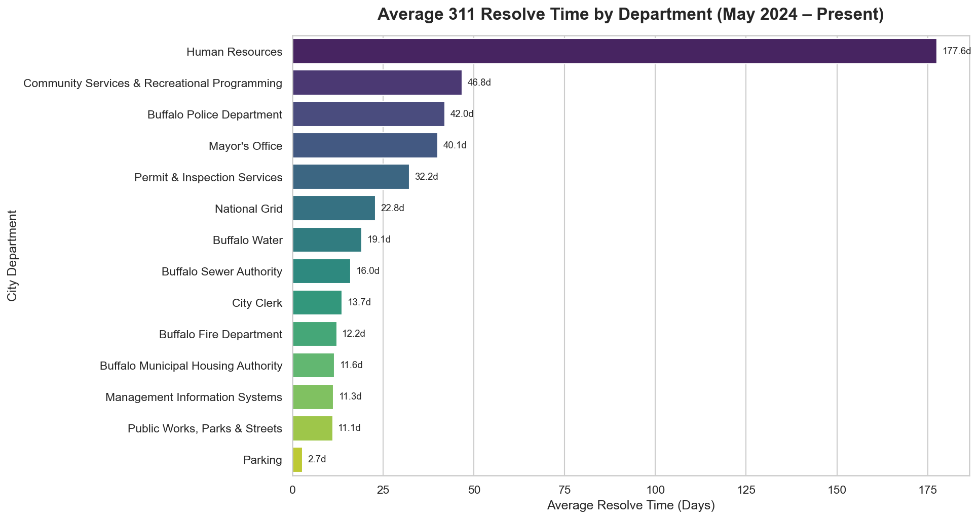
Departments at the top of this chart have the worst chronic backlogs. They likely need clearer escalation paths or additional staffing.
Chart 02 · Council Districts
Median Resolution Time by Council District
Median days to close per district. Median is chosen deliberately — it resists distortion from outlier cases and gives a fairer picture of the typical resident's wait.
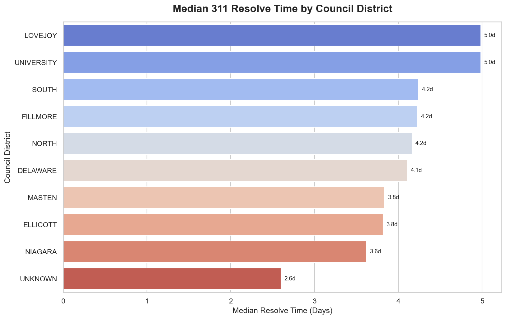
Variation between districts points to geographic inequity in service delivery — residents in slower districts wait measurably longer for the same requests.
Chart 03 · Distribution
Resolve Time Distribution — Capped at 180 Days
Histogram of all resolution times. Capped at 180 days so extreme outliers don't compress the visible range and hide the shape of most cases.
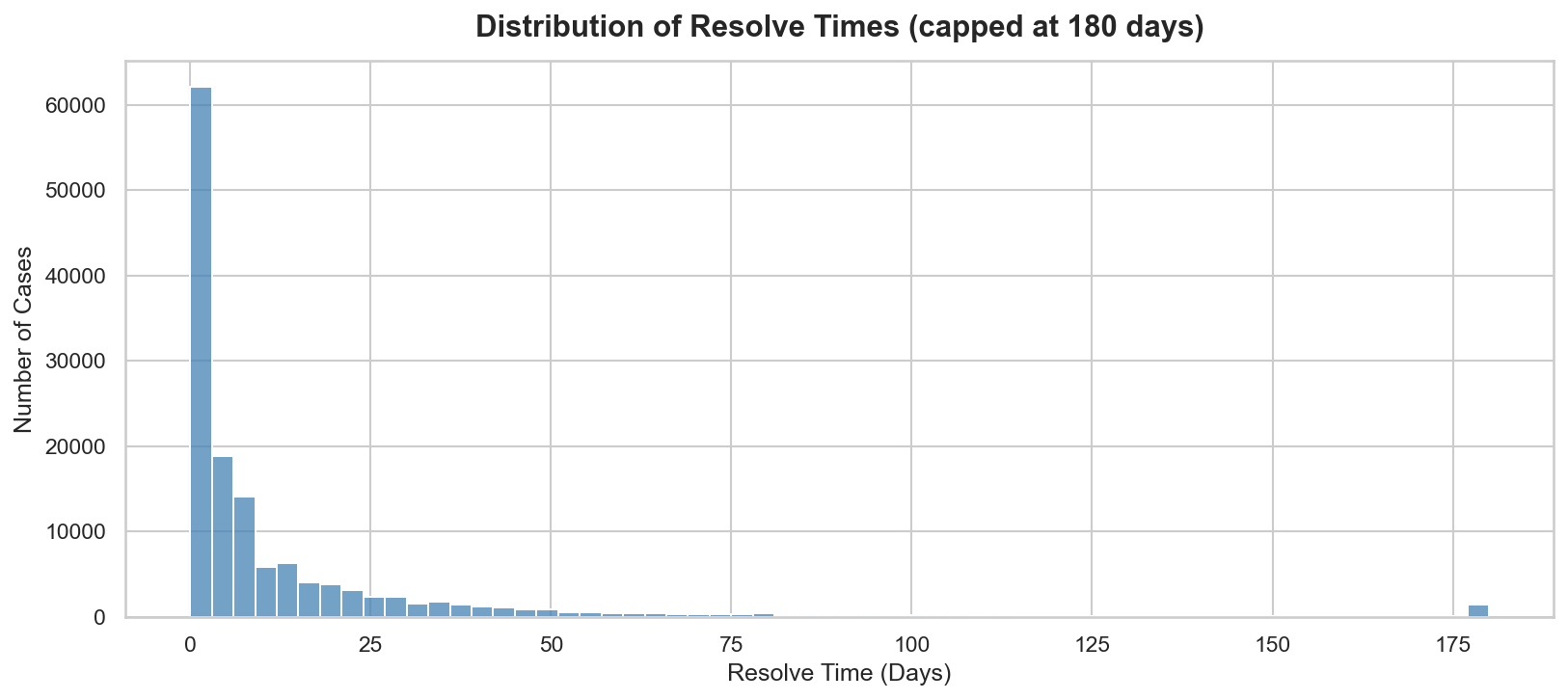
A healthy system shows a steep left spike — most cases close fast. A long tail toward 180 days signals chronic backlog. A bimodal shape (two humps) means there are two classes of cases: quick wins and permanently stuck ones.
Chart 04 · Volume Over Time
Monthly Case Volume — May 2024 to Present
Total 311 cases opened per month, resolved and filtered. Seasonal patterns and unexpected spikes are visible at this granularity.
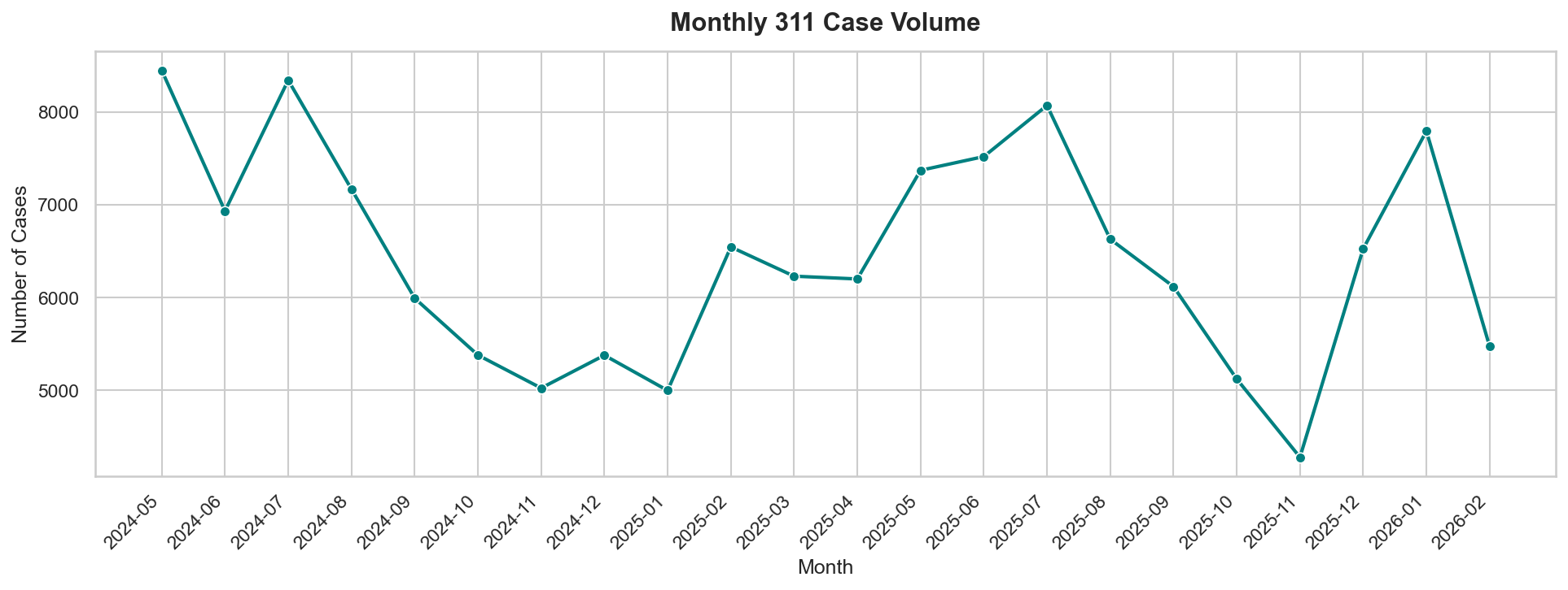
Summer months typically see higher volume — more outdoor activity means more resident reports. Spikes in winter may indicate weather-related service requests.